Sunshine Study Abroad captures the spirit of possibility — designed for students who dream beyond borders. This branding project focused on creating a complete visual identity system, including logo design, typography, colour philosophy, and a cohesive brand kit that could live across digital platforms and print.
The identity was crafted to feel modern, confident, and dependable — reflecting the brand’s role as a guide for students stepping into new academic and global opportunities.
1
The Intent
To create an identity that communicates trust and professionalism while still feeling energetic and aspirational.
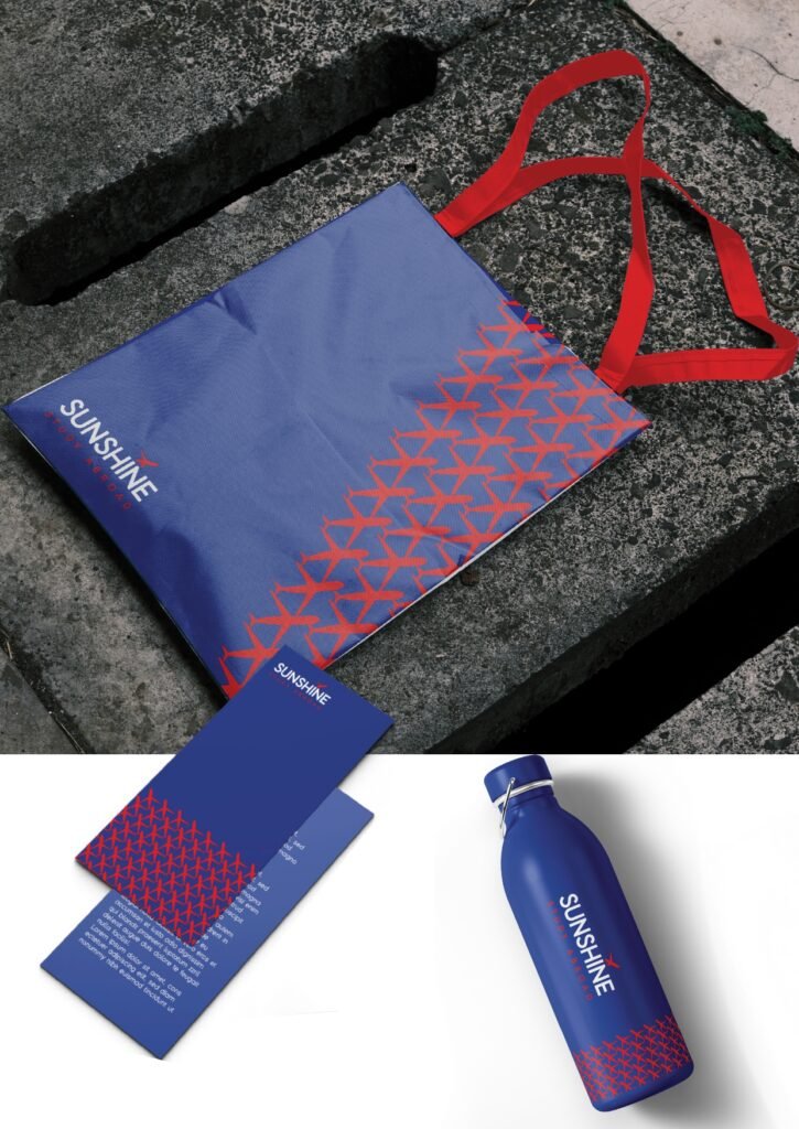
To design a brand system that supports real-world applications — from social media to stationery, brochures, and promotional materials.
2
Our Approach
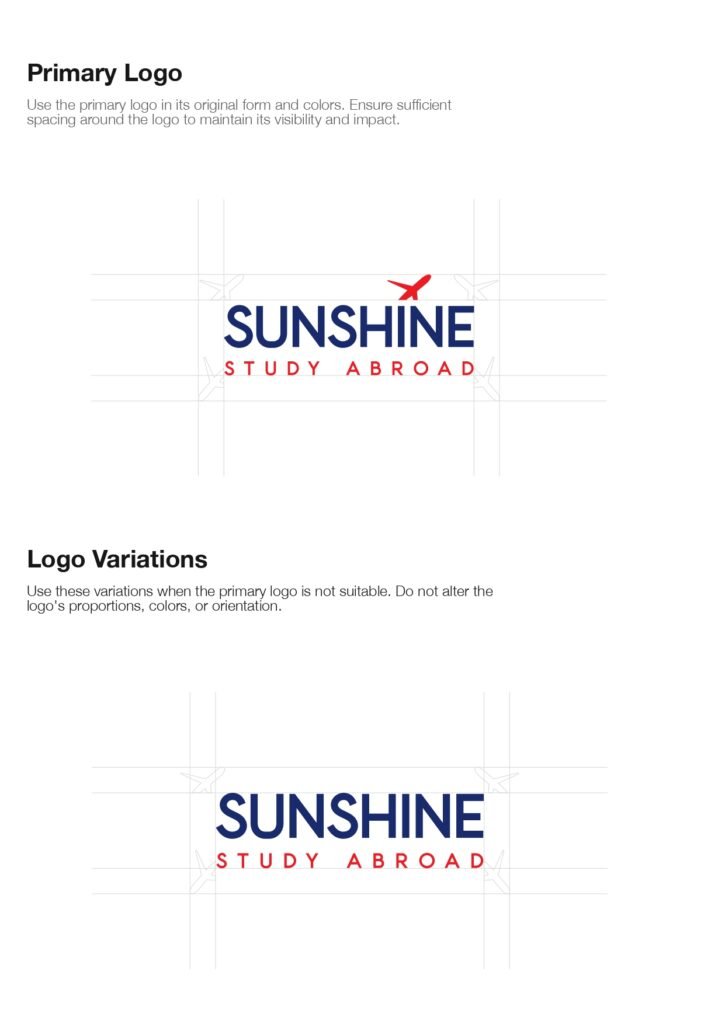
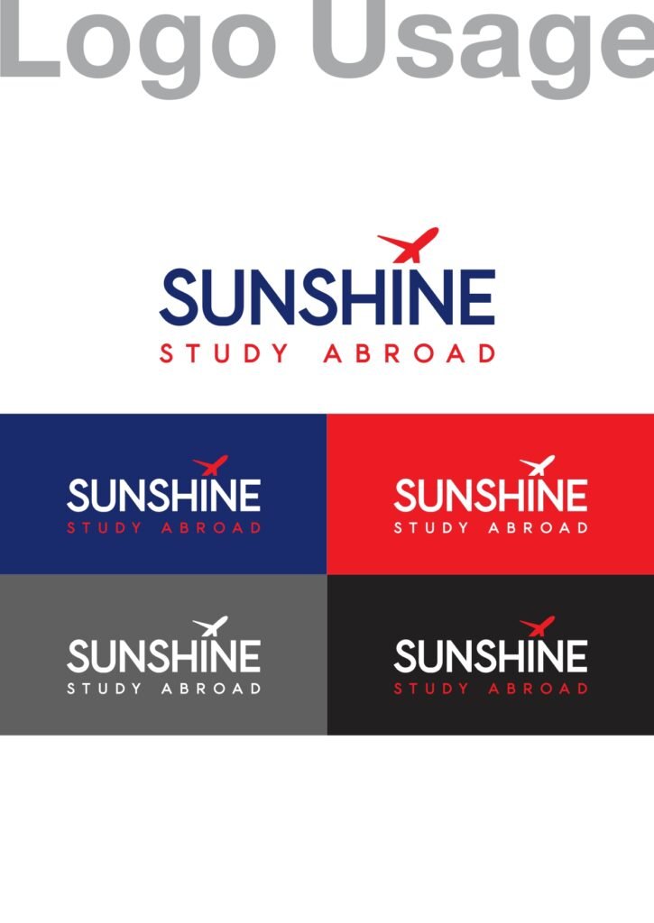
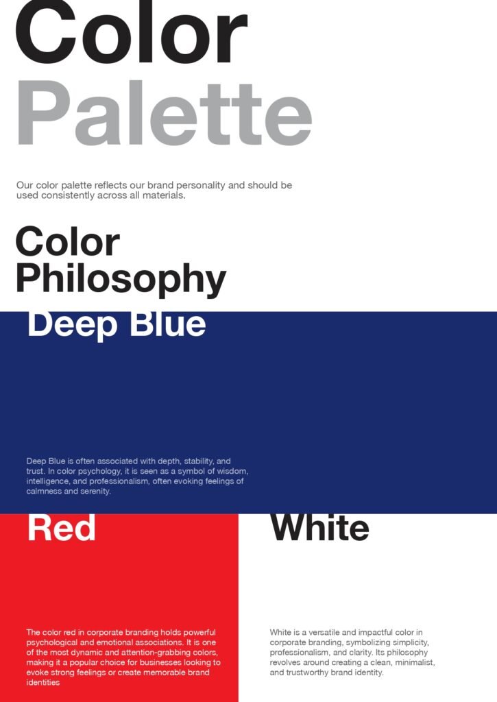
We built the identity around clarity and recognition. The logo was designed to be bold, minimal, and instantly memorable, with a travel-inspired symbol that reflects direction and movement. A strong typographic system was chosen to maintain consistency across platforms, while the colour palette was developed to balance credibility with impact.
Each element of the brand kit — from logo usage to stationery and mockups — was structured to ensure the brand stays consistent, scalable, and visually strong in every touchpoint.
3
The Outcome
A complete branding system that positions Sunshine Study Abroad as a modern, trustworthy, and aspirational education brand — ready to communicate confidently across both print and digital environments.